
The question nearly always arrives already narrowed. The walls are cream, they are staying cream, and what the person actually wants to know is which curtain colour will not look wrong against them.
That is the right way round. In most Indian flats the wall shade is not a decision anyone is currently making. It was chosen by a builder or a landlord years ago, and repainting a rented flat to suit a pair of curtains is nobody's plan. The wall, then, is the fixed part of the problem and the curtain is the variable.
So here is the short version. Against cream or off-white, a warm neutral in beige or taupe is the low-risk answer, and charcoal or olive is what gives a pale room some weight. Against grey walls, either drop two or three shades within the same grey, or bring in one warm colour such as mustard or rust. Against a dark painted wall, keep the curtain lighter than the wall, or that corner of the room closes in on itself.
How far past those defaults you can go depends on the light that window actually gets.
Curtain colour combinations by the wall you already have
| Wall colour | Low-risk choice | Bolder choice | What tends to go wrong |
|---|---|---|---|
| Cream or off-white | Beige, taupe, warm grey | Charcoal, olive, terracotta | A cool blue-grey can read slightly grubby next to warm cream |
| Stark white | Charcoal, navy, deep green | Almost any saturated colour | Cream curtains tend to read as dirty white against true white |
| Grey | A deeper shade of the same grey | Mustard, rust, dark green | Two greys of different temperature clash harder than grey and colour |
| Dark or accent wall | Anything clearly lighter than the wall | A shade just off the wall colour | Dark on dark deletes the window from the room |
Cream and off-white walls

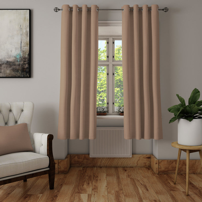
Cream is a warm colour, even when it is so pale you stop registering it as one, so warm neutrals sit against it quietly. That is what you want when the curtains are meant to recede. The cotton beige pair is a plain solid in a cotton panama weave, roughly ₹1,700 to ₹2,550 a pair, with the price rising as the drop gets longer. Settle the length before the colour, using the curtain size guide, because a shade that suits the wall is no use in the wrong drop. Worth knowing before you order: in its own photographs the beige leans warm and faintly pink rather than flat sand, so it works better against cream than against a cool grey.
If quiet is not the goal, cream walls will carry a much darker curtain than people expect. Charcoal, olive and terracotta all hold their own against a pale warm wall, because the wall is doing so little that the curtain is free to do a lot. The exception is a cool blue-grey, which next to warm cream can look less like a colour choice and more like a white curtain washed a few too many times.
Stark white walls
True white is a different wall from cream, and the common mistake is buying a cream or ivory curtain for a white-painted room. Off-white against genuine white rarely reads as the soft tonal pairing people are hoping for. It usually reads as dirty white, unless that ivory turns up elsewhere in the room, in the trim or the upholstery, so it looks repeated rather than mismatched.
The upside is that white tolerates more contrast than any other wall. Nothing in the wall colour can clash, so a deep green, a navy or a charcoal reads as intentional rather than heavy, and a strong print has room to be seen. With white walls the harder question is usually how much light you want to keep out, not what goes with what.
Grey walls
Grey is the wall colour that catches people out, because grey has a temperature. A warm greige wall and a cool blue-toned grey curtain will both be called grey on their labels and will still look wrong together in a way that is hard to name. The awkward part is that undertone is close to unjudgeable from a photograph on a phone, so two greys that look identical on screen can turn out to be a warm one and a cool one. This is the wall colour where holding the actual fabric against the actual paint is worth the trouble.
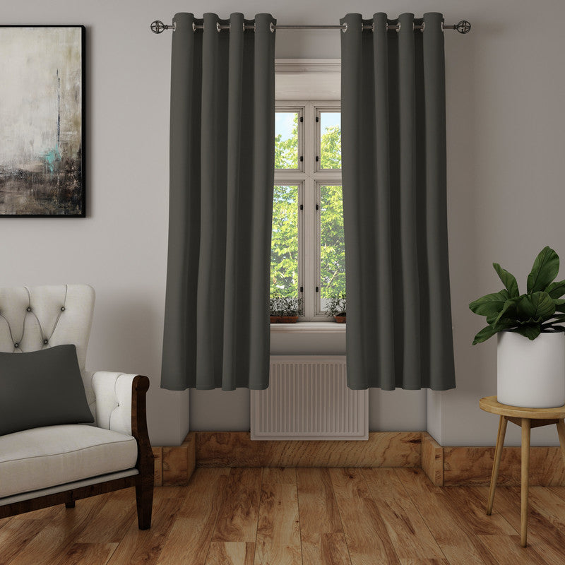
The safe route is tonal: take the wall's own grey several shades darker, which is where a charcoal grey pair earns its place. It is the same cotton panama weave and the same ₹1,700 to ₹2,550 band as the beige. Charcoal against a light grey wall gives you a clear frame around the window without introducing a second colour to the room.
Tonal is safe, though not always interesting. A grey wall with a grey curtain and a grey sofa needs texture or a warm accent somewhere or it looks flat by evening. That is the case for the other route: one warm colour, mustard or rust or deep terracotta, against the cool wall. It works because warm and cool sit opposite each other.
A dark or painted accent wall
Keep the curtain clearly lighter than the wall. Dark on dark does not create depth, it removes the window, and once the panels are drawn that corner stops reading as a window at all. If you do want it, the curtain has to differ in something other than colour, usually sheen or weave, so there is still an edge where the fabric ends.
What the colour does once the sun goes down

Nobody sells you a curtain under the light you will live with it in. Shop lighting is bright and neutral. Home lighting is not, and runs from warm white bulbs labelled 2700K or 3000K on the box to cool daylight tubes. Warm light pushes everything yellow, so mustard, rust, maroon and wood tones deepen while a grey that looked crisp at noon goes slightly muddy and navy flattens towards black. A cool daylight tube does the reverse, sharpening blues and prints and draining some of the warmth out of beige and terracotta.
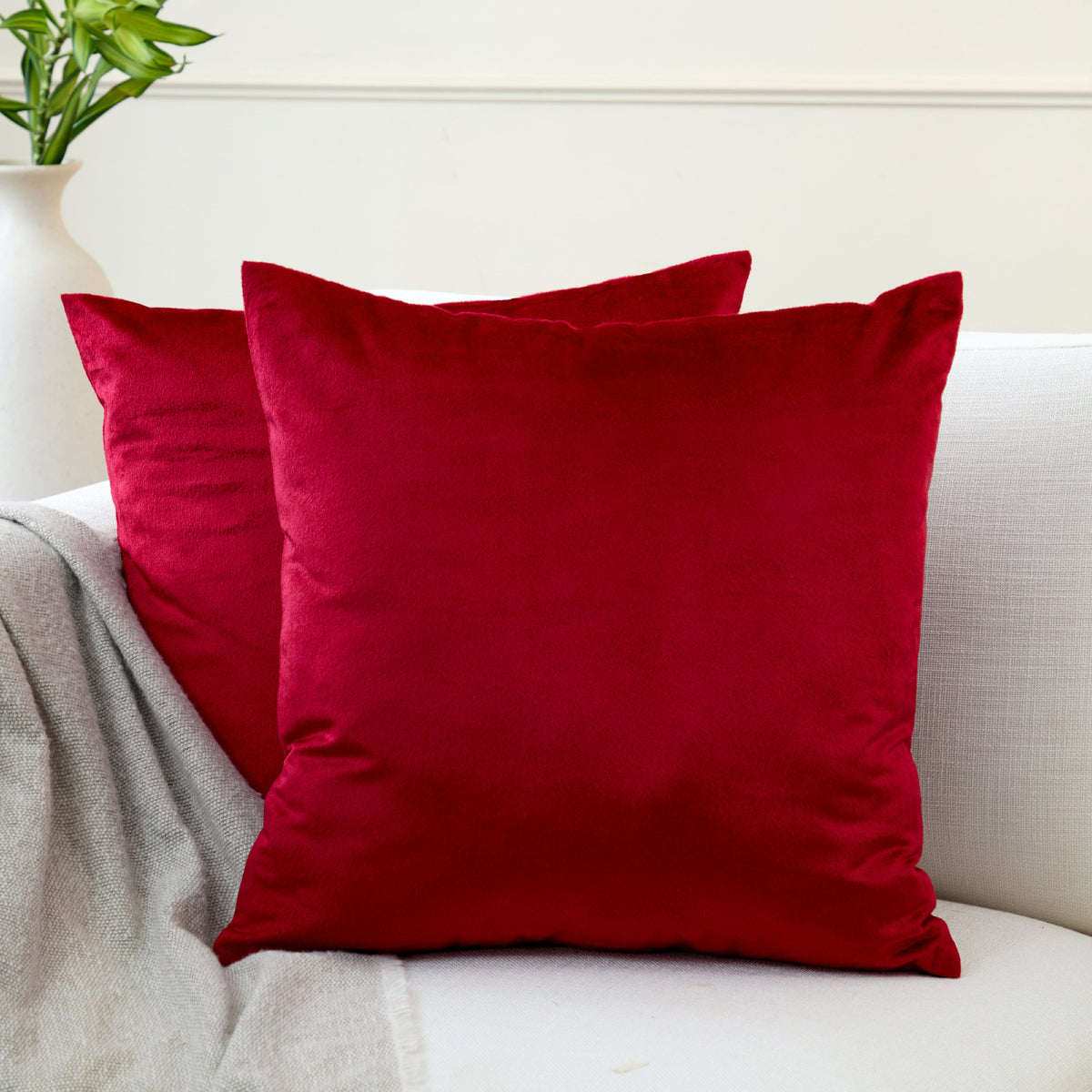
One product's own photographs show this plainly. The canvas rich maroon panel is a solid dyed cotton canvas, and the close-up frames of the cloth itself show exactly that, a flat deep wine red with a visible canvas weave. In the frames where the panel is hung with the window behind it, the same fabric reads dusty pink with a lilac cast through the middle where daylight is coming through it. The curtain did not change, only which side the light was on, and a light-filtering weave rather than a blackout will do the same on any window with daylight behind it.
The practical version takes ten seconds. Hold the fabric flat against the wall next to the window at around 8pm with the room's own lights on, then look again at eleven the next morning. A colour that works in only one of those two conditions is the wrong colour.
Do dark curtains show dust more than light ones?

This gets argued both ways, usually with confidence and rarely with a reason. The reason is worth having. Household dust and lint are pale, so what makes them visible is contrast against what is behind them. A very dark solid gives that dust maximum contrast, which is why black and deep navy panels look dusty first, especially along the top where the fabric barely moves.
Stark white does not escape by being the opposite. It hides pale dust well and shows everything else instead, mainly the grey handling marks down the leading edge where the curtain gets pulled every day.
What genuinely hides both is the middle: mid-toned solids in grey, taupe, beige or olive, and any print at all. A pattern breaks up the surface so there is no clean field for a fine layer of dust to sit against. If the window sits over a busy road, that is reason enough to rule out both extremes and work through the mid-tones and prints in the curtain range instead of choosing on shade alone. The twigs grey pair is a good example of the type, a mid-grey blackout polyester with a fine white branch print all over it, just under ₹2,000 to about ₹2,550 a pair. Note that this one stops short of the longest drop the range goes to, so check it against your own measurement before ordering for a full-height balcony door.
The colour to buy if you might move
If there is any chance of a new flat within a year or two, colour becomes a risk question rather than a taste one. Rented flats are commonly repainted in cream, off-white or pale grey between tenants, so the next walls are likely pale too. A warm neutral in beige, taupe or a mid warm grey sits acceptably against nearly any pale wall, so the curtains move with you and still work.
A saturated colour chosen for one particular wall is a bet on the next wall matching it, and the deep teal that worked against a grey feature wall can look stranded in a cream room. Plain solids from the cotton canvas curtain range travel between rooms far more easily than prints do.
Before you commit to a saturated dark colour

Deep saturated dyes have more colour to lose than pale ones, so on a sunny window fading tends to show sooner and more obviously on maroon, navy and black than on beige. How fast it happens depends on the dye and the fibre as much as on the shade. That is a reason to think about which window, not to avoid dark curtains.
What surprises people is where the fading lands. On a window taking direct afternoon sun, a hanging curtain is not evenly lit. The outer face of every fold catches the light while the fabric tucked inside the fold stays shaded, so what eventually appears is faint vertical banding down the panel rather than a uniform lightening. It reads as a fault in the fabric even though it is just geometry. On a window with only morning or indirect light none of this matters much. The maroon canvas panel above, sold singly at around ₹1,210 to ₹1,280, is the sort of saturated colour worth putting somewhere other than the sunniest window in the flat.
Frequently asked questions
Should curtains be lighter or darker than the wall?
Either works, but they should not be a near miss. Curtains clearly lighter or clearly darker than the wall look chosen, while curtains within a shade or two of the wall look like an attempt at matching that failed.
Do the curtains have to match the sofa?
No, and matching them often makes a room feel like a showroom. It is easier to let the curtains answer the wall, the bigger surface and the one you cannot move, and let cushions answer the sofa. They only need to avoid fighting, which mostly means keeping two strong prints off the same sightline.
Will a white curtain look wrong against a cream wall?
It can. Pure white against warm cream tends to make the wall look yellow and the curtain look cold, because each exaggerates what the other is not. An off-white or ivory curtain sits far better on cream walls, and pure white is better saved for genuinely white ones.

Leave a comment
This site is protected by hCaptcha and the hCaptcha Privacy Policy and Terms of Service apply.